

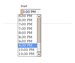
Provides a form Date field component for selecting time values. A drop down selection of time values are displayed in half hour segments. (48 total) The 'G' stands for Google as the control was largely based around the Google Calendar time input javascript widget.
JavaScript must be enabled in the client browser to use the drop down picker. If JavaScript is not enabled users can still enter a date value in the HTML text field.
This component needs a Body component and a Shell or ScriptIncludes component to work.
See also: DropdownTimePicker , DropdownDatePicker , DatePicker
| Name | Type | Required | Default | Description |
|---|---|---|---|---|
| value | Object | yes | The data value. Take care to ensure date time values are 'normalized' before performing any millisec based comparison or equality operations as the date portion of the translated object will likely be the current day. | |
| disabled | boolean | no | false | Controls whether the input field is active or not. |
| displayName | String | no | The user-presentable name for the component, which will be used by a FieldLabel connected to the component. | |
| validators | Array or collection of Validator | no |
The validators to apply to the component. Something along the lines of:
validators:required .See also: Validation |
|
| translator | Translator | no | translator:date,pattern=h:mm a |
The translator to use when displaying and parsing the time.
See also: Validation |
| iconAlt | String | no | literal:Select a Time | The textual name given to the date picking icon before the image is loaded. |
Body: removed
Informal parameters: allowed
Reserved parameters: name, autocomplete, type
You will need to define a couple css class definitions in order to have your time picker displayed properly. The image displayed of the picker at the top of this page was rendered using the css definitions of:
.dropdownCombobox {
    background: #ffffff;
    border: 1px solid #545454;
}

.dropdownOption {
    font-family: arial;
    font-size: 0.8em;
    padding: 0.1em 0 0.1em 0.2em;
    cursor:hand;
    cursor:pointer;
}

.optionHover {
    background: cornflowerblue;
    color: #ffffff;
}