

The exact same thing as the standard TextField component - with the additional client side behavior of providing a dynamic autocompletion suggestion list drop down below the field as input is typed in.
The main distinction between this and TextField is that this component needs some additional parameters such as the source of the dynamic list that will be generated - as well as a listener method to invoke on your page / component when something has been typed in on the client side input field.
In addition to the regular client side enhancements this component can optionally render either a <input type="text" /> standard
form input field or it can render a <textarea>Paragraph text...</textarea>. The type rendered depends on how you
define the component in your html template. Following is a small example of defining it as a textarea or input:
<input jwcid="@Suggest" listener="listener:filterSearch" listSource="ognl:listValues" />

...

<textarea jwcid="@Suggest" listener="listener:filterSearch" listSource="ognl:listValues" />
See also: Suggest , ListItemRenderer , DefaultListItemRenderer , Script.aculo.us Ajax.Autocompleter , TextField
| Name | Type | Required | Default | Description |
|---|---|---|---|---|
| value | string | yes | The value to be editted, which is is usually a string. Tapestry has limited ability to convert to and from strings. | |
| disabled | boolean | no | false |
If true, then a disabled attribute will be rendered as part of the
<input> or <textarea> tag, and the component will not update its value parameter
when the form is submitted.
|
| displayName | string | no | The user-presentable name for the component, which will be used by a FieldLabel connected to the component. | |
| validators | Array or collection of Validator | no |
The validators to apply to the component. Something along the lines of:
validators:required .See also: Validation |
|
| translator | Translator | no |
The translator to use when displaying and parsing the date.
See also: Validation |
|
| hidden | boolean | no | false | If true, then the type attribute will be "password", not "text", and user input in the browser will be masked. |
| listener | IActionListener | no |
Specifies an object that is notified when input is typed in to the field, which is
typically a listener method of its container (for example, listeners.
method). This listener method will by default contain exactly one parameter of type String when
invoked - which wil be the value that was typed in to the field in the browser. You may add other
additional parameters using the parameters parameter of this component. If this parameter is not provided,
Tapestry will attempt to find a listener with the capitalized id of the
component, prefixed by "do". For example, jwcid="nameSearch@Suggest" would expect
a listener called doNameSearch().
See also: Users Guide - Listeners |
|
| parameters |
Object or
Object[] or List |
no |
An array of objects to be encoded into the URL. These parameters will be decoded when the listener method is executed. In a web application built onto of Enterprise JavaBeans, the context is often the primary key of some Entity bean; typically such keys are Strings or Integers.
A listener method can retrieve the parameters three ways:
Prior to release 2.2, the parameters were always type String. They may now be of any type; type will be maintained when the parameters are later retrieved by a listener. See SqueezeAdaptor for more details. |
|
| stateful | boolean | no | false | If true, then the component requires an active (i.e., non-new) HttpSession when triggered. Failing that, it throws a StaleLinkException . If false, then no check is necessary. The latter works well with links that encode all necessary state inside the URL itself. |
| listSource | Iterator, Collection, Object[], or Object | yes |
The source of objects to be iterated, which may be a Collection, an
Iterator, an array of Objects, or a even a single Object (which is
treated as a singleton collection).
This list is used as the source for all dynamic autocompletions and is expected to be appropriately filtered by you when the corresponding listener method is invoked to filter the list of available options. |
|
| listItemRenderer | ListItemRenderer | yes | DefaultListItemRenderer |
This is the object that the component will defer actual rendering of the dynamic html list to. According to the
Script.aculo.us Ajax.Autocompleter documentation
it is expected that this renderer return an unordered html list at the very least:
<ul>
    <li>First Option</li>
    <li>Second Option</li>
    <li>Third Option</li>
</ul>
More elaborate options are of course possible - such as the TimeTracker demo where the options returned contain image references to render the flag associated with different countries using a custom ListItemRenderer implementation. The source for this custom implementation example can be found here. |
| maxResults | int | no | Optionally specified the maximum number of autocomplete suggestions that will be displayed to users. | |
| updateElementClass | String | no | autocomplete |
Specifies the html css class attribute that will be written to the hidden <div> that this component generates
for the local client side javascript to populate the autocompletion results in to. Override this parameter if you would
like to change the css class name to another definition.
The TimeTracker demo page defines an inline
css style block to style the autocompletion results (something you will have to do for it to be usable at all)
using something like the following:
<style type="text/css">
        div.autocomplete {
            position:absolute;
            width:250px;
            background-color:white;
            border:1px solid #888;
            margin:0px;
            padding:0px;
        }
        div.autocomplete ul {
            list-style-type:none;
            margin:0px;
            padding:0px;
        }
        div.autocomplete ul li.selected { background-color: #ffb;}
        div.autocomplete ul li {
            list-style-type:none;
            display:block;
            margin:0;
            padding:4px 0 4px 4px;
            cursor:pointer;
        }
        div.autocomplete ul li img { border:none; margin-right: 10px; vertical-align:middle;}
    </style>
Warning: This component provides no default css style rules for the returned list - so if you don't define any such as the example above shows your copmonent is not likely to work very well or be very usable. There are other examples of default styling provided in the Script.aculo.us Ajax.Autocompleter documentation. |
| options | String | no | literal:{method: 'get', frequency: 0.2} |
There are additional options for configuring how the client side behavior of this component works covered in the
Script.aculo.us Ajax.Autocompleter documentation. By
default this component uses http get (something highly reccomended, it probably wouldn't even work with post) and configures
the frequency with which results are grabbed for autocompletion when input changes as 0.2 seconds. The configuration specified
here is passed in directly to the client side script.aculo.us object so they must conform to
JSON syntax rules or it will result in a parse exception being generated when your html template is
processed by tapestry. (JSON = JavaScript Object Notation)
You can also pass in things like afterUpdateElement:"nameOfClientSideJavascriptFuncion", which is a way of having your custom
javascript functions called after an item has been selected from the autocompletion list.
Please see the Script.aculo.us Ajax.Autocompleter documentation for more information on all the available options. |
Body: removed
Informal parameters: allowed
Reserved parameters: name, autocomplete
This example is a basic bare-minimum using the majority of built in defaults to do something similar to the TimeTracker demo - only without the custom ListItemRenderer implementation. There is no .page file shown here as this example uses annotations to define the page properties used.
<span jwcid="@Border">
<p>
Autocompleting input suggestion fields using scriptaculous javascript library.
</p>
<style type="text/css">
div.autocomplete {
position:absolute;
width:250px;
background-color:white;
border:1px solid #888;
margin:0px;
padding:0px;
}
div.autocomplete ul {
list-style-type:none;
margin:0px;
padding:0px;
}
div.autocomplete ul li.selected { background-color: #ffb;}
div.autocomplete ul li {
list-style-type:none;
display:block;
margin:0;
padding:4px 0 4px 4px;
cursor:pointer;
}
div.autocomplete ul li img { border:none; margin-right: 10px; vertical-align:middle;}
</style>
<form jwcid="@Form" class="container">
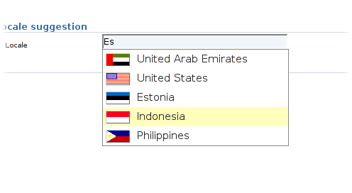
<h3>Locale suggestion</h3>
<fieldset>
<table width="90%" class="form" cellpadding="2" cellspacing="0" >
<tbody>
<tr>
<td><label jwcid="@FieldLabel" field="component:suggest" /></td>
<td><input jwcid="suggest" size="34" /></td>
</tr>
</tbody>
</table>
</fieldset>
</form>
</span>public abstract class LocaleSuggest extends BasePage {
@Component(bindings = {"value=inputLocale",
"displayName=literal:Locale",
"listSource=localeList",
"listener=listener:suggestLocale"})
public abstract Suggest getSuggest();
public abstract String getInputLocale();
public abstract String getFilterString();
public abstract void setFilterString(String filter);
public List getLocaleList()
{
String filter = getFilterString();
Locale[] locales = Locale.getAvailableLocales();
if (filter == null || filter.length() < 1)
{
return Arrays.asList(locales);
}
filter = filter.toUpperCase();
List<Locale> ret = new ArrayList<Locale>();
// used to ensure no duplicates are stored in the list as java.util.Locale doesn't
// provde an equals() method.
List temp = new ArrayList();
for (Locale locale : locales)
{
if (locale.getDisplayCountry().toUpperCase().indexOf(filter) > -1
&& !temp.contains(locale.getDisplayCountry()))
{
ret.add(locale);
temp.add(locale.getDisplayCountry());
}
}
return ret;
}
/**
* Invoked dynamically via XHR whenever input changes in the form input field. The method above - getLocaleList() -
* is what actually filters the list of suggested options displayed based on the characters they typed in to the input field.
*/
public void suggestLocale(String filter)
{
setFilterString(filter);
}
}