 org.apache.tapestry5.corelib.base.AbstractField
org.apache.tapestry5.corelib.components.Palette
org.apache.tapestry5.corelib.base.AbstractField
org.apache.tapestry5.corelib.components.Palette
|
||||||||||
| PREV CLASS NEXT CLASS | FRAMES NO FRAMES | |||||||||
| SUMMARY: NESTED | FIELD | CONSTR | METHOD | DETAIL: FIELD | CONSTR | METHOD | |||||||||
java.lang.Object
@Import(library="palette.js")
public class Palette
Multiple selection component. Generates a UI consisting of two <select> elements configured for multiple selection; the one on the left is the list of "available" elements, the one on the right is "selected". Elements can be moved between the lists by clicking a button, or double clicking an option (and eventually, via drag and drop).
The items in the available list are kept ordered as perSelectModel order. When items are moved from the
selected list to the available list, they items are inserted back into their proper positions.
The Palette may operate in normal or re-orderable mode, controlled by the reorder parameter.
In normal mode, the items in the selected list are kept in the same "natural" order as the items in the available
list.
In re-order mode, items moved to the selected list are simply added to the bottom of the list. In addition, two extra
buttons appear to move items up and down within the selected list.
Much of the look and feel is driven by CSS, the default Tapestry CSS is used to set up the columns, etc. By default,
the <select> element's widths are 200px, and it is common to override this to a specific value:
 <style>
 DIV.t-palette SELECT { width: 300px; }
 </style>
You'll want to ensure that both <select> in each column is the same width, otherwise the display will update
poorly as options are moved from one column to the other.
Option groups within the SelectModel will be rendered, but are not supported by many browsers, and are not
fully handled on the client side.
For an alternative component that can be used for similar purposes, see
Checklist.
Form,
Select| Component Parameters | ||||||
|---|---|---|---|---|---|---|
| Name | Description | Type | Flags | Default | Default Prefix | Since |
| availableLabel | Allows the title text for the available column (on the left) to be modified. As this is a Block, it can contain conditionals and components. The default is the text "Available". | org. | Required, Not Null | message: | literal | |
| clientId | The id used to generate a page-unique client-side identifier for the component. If a component renders multiple times, a suffix will be appended to the to id to ensure uniqueness. The uniqued value may be accessed via the clientId property. | String | prop: | literal | ||
| deselect | The image to use for the deselect button (the default is a left pointing arrow). | org. | asset: | prop | ||
| disabled | If true, then the field will render out with a disabled attribute (to turn off client-side behavior). When the form is submitted, the bound value is evaluated again and, if true, the field's value is ignored (not even validated) and the component's events are not fired. | boolean | false | prop | ||
| encoder | A ValueEncoder used to convert server-side objects (provided from the "source" parameter) into unique client-side strings (typically IDs) and back. Note: this component does NOT support ValueEncoders configured to be provided automatically by Tapestry. | org. | Required, Not Null | prop | ||
| label | The user presentable label for the field. If not provided, a reasonable label is generated from the component's id, first by looking for a message key named "id-label" (substituting the component's actual id), then by converting the actual id to a presentable string (for example, "userId" to "User Id"). | String | literal | |||
| model | Model used to define the values and labels used when rendering. | org. | Required, Not Null | prop | ||
| moveDown | The image to use for the move down button (the default is a downward pointing arrow). | org. | asset: | prop | ||
| moveUp | The image to use for the move up button (the default is an upward pointing arrow). | org. | asset: | prop | ||
| reorder | If true, then additional buttons are provided on the client-side to allow for re-ordering of the values. | boolean | false | prop | ||
| select | The image to use for the select button (the default is a right pointing arrow). | org. | asset: | prop | ||
| selected | The list of selected values from the org.apache.tapestry5.SelectModel. This will be updated when the form is submitted. If the value for the parameter is null, a new list will be created, otherwise the existing list will be cleared. If unbound, defaults to a property of the container matching this component's id. | java. | Required | prop | ||
| selectedLabel | Allows the title text for the selected column (on the right) to be modified. As this is a Block, it can contain conditionals and components. The default is the text "Available". | org. | Required, Not Null | message: | literal | |
| size | Number of rows to display. | int | symbol: | prop | ||
| validate | The object that will perform input validation. The validate binding prefix is generally used to provide this object in a declarative fashion. | org. | validate | 5.2.0 | ||
For this example, we'll implement a page from an e-commerce order wizard; the page collects information about special handling for the order:
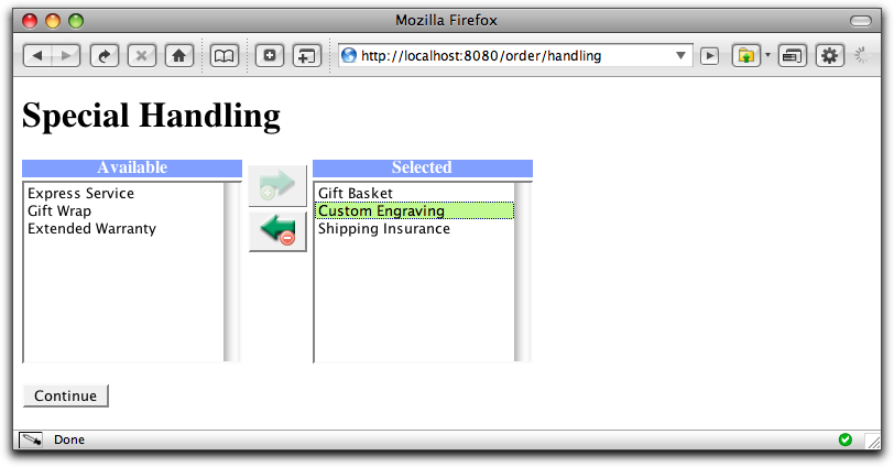
This single screen shot doesn't capture the full richness of the user experience provided by the Palette component. The buttons enable and disable themselves based on what's selected. You can move items by double clicking, and you can move multiple items by selecting them and and then clicking the button.
This is a far better experience than using
public enum SpecialHandling
{
    EXPRESS_SERVICE, GIFT_WRAP, GIFT_BASKET, CUSTOM_ENGRAVING, SHIPPING_INSURANCE,
    EXTENDED_WARRANTY
}
In this contrived example, the possible types of special handling are defined using an enum. It's more likely, in the real world, that this would be defined in terms of a database entity.
<html xmlns:t="http://tapestry.apache.org/schema/tapestry_5_0_0.xsd">
    <body>
        <h1>Special Handling</h1>

        <t:form>

            <t:palette t:id="handling" encoder="encoder" model="model"/>

            <br/>

            <input type="submit" value="Continue"/>

        </t:form>

    </body>
</html>
Here we are able to omit the selected parameter (the list of selected items) because the Palette component's id matches a property of the page.
The model parameter will define the available options that can be selected. The encoder parameter will define how to translate server side values (the enum values) into client side strings and back.
public class OrderHandling
{
    @Property
    @Persist
    private List<SpecialHandling> handling;

    @Inject
    private Messages messages;

	@Inject
    private TypeCoercer typeCoercer;

    @Property
    private final ValueEncoder<SpecialHandling> encoder = new EnumValueEncoder(typeCoercer, SpecialHandling.class);

    @Property
    private final SelectModel model = new EnumSelectModel(SpecialHandling.class, messages);
}
Tapestry has built-in public classes that help convert enum types into value encoders and select models.
Injecting a Messages object gives a component access to its own message catalog.
The Palette component will read the handling property when rendering (it's ok for it to be null). When the form is submitted, it will create a new List and update the handling property.
The Palette can also be used to order, not just select, items, by binding the reorder parameter to true. In that case, additional buttons are added that allow selected items to be moved up or down the list.
The Palette can be further customized through a mix of CSS and by replacing the images used for its various buttons.
| Constructor Summary | |
|---|---|
Palette()
|
|
| Method Summary | |
|---|---|
Renderable |
getAvailableRenderer()
|
Renderable |
getSelectedRenderer()
|
boolean |
isRequired()
Returns false; most components do not support declarative validation. |
protected void |
processSubmission(String controlName)
Method implemented by subclasses to actually do the work of processing the submission of the form. |
| Methods inherited from class org.apache.tapestry5.corelib.base.AbstractField |
|---|
decorateInsideField, getClientId, getControlName, getLabel, isDisabled, putPropertyNameIntoBeanValidationContext, removePropertyNameFromBeanValidationContext, setDecorator, setFormSupport |
| Methods inherited from class java.lang.Object |
|---|
clone, equals, finalize, getClass, hashCode, notify, notifyAll, toString, wait, wait, wait |
| Constructor Detail |
|---|
public Palette()
| Method Detail |
|---|
public Renderable getAvailableRenderer()
public Renderable getSelectedRenderer()
protected void processSubmission(String controlName)
AbstractFielddisabled.
processSubmission in class AbstractFieldcontrolName - the control name of the rendered element (used to find the correct parameter in the request)public boolean isRequired()
AbstractField
isRequired in interface FieldisRequired in class AbstractField
|
||||||||||
| PREV CLASS NEXT CLASS | FRAMES NO FRAMES | |||||||||
| SUMMARY: NESTED | FIELD | CONSTR | METHOD | DETAIL: FIELD | CONSTR | METHOD | |||||||||