- java.lang.Object
-
- org.apache.tapestry5.corelib.components.Radio
-
- All Implemented Interfaces:
- ClientElement, Field
public class Radio
extends Object
implements Field
A radio button (i.e., <input type="radio">). Radio buttons must operate within aRadioContainer(normally, theRadioGroupcomponent). If the value parameter is not bound, then the default value is a property of the container component whose name matches the Radio component's id.- See Also:
RadioGroup,Form,Select
Component Parameters Name Type Flags Default Default Prefix disabled boolean false prop If true, then the field will render out with a disabled attribute (to turn off client-side behavior). Further, a disabled field ignores any value in the request when the form is submitted. label String literal The user presentable label for the field. If not provided, a reasonable label is generated from the component's id, first by looking for a message key named "id-label" (substituting the component's actual id), then by converting the actual id to a presentable string (for example, "userId" to "User Id"). value Object Required prop The value associated with this radio button. This is used to determine which radio button will be selected when the page is rendered, and also becomes the value assigned when the form is submitted. Examples
Radio components are always used in conjunction with a RadioGroup component. The RadioGroup defines the property that will be read and updated, and the individual Radio components determine what value will be assigned to the property.
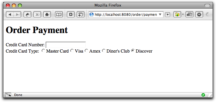
Our example will be part of a page that collects credit card information. We'll just be showing the portions related to a set of radio buttons for choosing the type of credit card.

CardType.java
public enum CardType
{
    MASTER_CARD, VISA, AMERICAN_EXPRESS, DINERS_CLUB, DISCOVER
}
Payment.tml
<html xmlns:t="http://tapestry.apache.org/schema/tapestry_5_0_0.xsd">
    <body>
        <h1>Order Payment</h1>

        <t:form>
            <t:label for="cardNumber"/>:

            <t:textfield t:id="cardNumber" size="16"/>

            <br/>

            <t:label for="type"/>:

            <t:radiogroup t:id="type">
                <t:radio t:id="masterCard"/>
                <t:label for="masterCard"/>
                <t:radio t:id="visa"/>
                <t:label for="visa"/>
                <t:radio t:id="amex"/>
                <t:label for="amex"/>
                <t:radio t:id="dinersClub"/>
                <t:label for="dinersClub"/>
                <t:radio t:id="discover"/>
                <t:label for="discover"/>
            </t:radiogroup>

        </t:form>

    </body>
</html>
The advantage of using radio buttons here, rather than a drop down list, is that we could extend the labels to use a small image of each type of supported card.
We're once again using the trick of matching the component's id to a property of the containing page. The RadioGroup's value parameter will be bound to the page's type property. Likewise, each of the Radio components will be matched to a property of the page.
Payment.java (partial)
public class Payment
{
    . . .

    @Property
    @Persist
    private CardType type;

    public CardType getMasterCard() { return CardType.MASTER_CARD; }

    public CardType getVisa() { return CardType.VISA; }

    public CardType getAmex() { return CardType.AMERICAN_EXPRESS; }

    public CardType getDinersClub() { return CardType.DINERS_CLUB; }

    public CardType getDiscover() { return CardType.DISCOVER; }

    . . .
}
We use a number of read-only properties to provide each Radio component with its corresponding enum value, that will ultimately be assigned to the page's type property (if that corresponding Radio component is selected by the user).
This is far from the only pattern of usage; it is much more likely that you will use a Loop component around a single Radio component than you will use a whole array of Radio components as in this example.
Payment.properties
We override the default generated labels for a few fields and enum values:
cardnumber-label=Credit Card Number
type-label=Credit Card Type
dinersclub-label=Diner's Club
-
-
Constructor Summary
Constructors Constructor and Description Radio()
-
Method Summary
Methods Modifier and Type Method and Description StringgetClientId()Returns a unique id for the element.StringgetControlName()Returns the control name provided by the containingRadioContainer.StringgetLabel()Returns a user presentable (localized) label for the field, which may be used inside <label> elements on the client, and inside client or server-side validation error messages.booleanisDisabled()Returns true if this component has been expressly disabled (via its disabled parameter), or if thecontainerhas been disabled.booleanisRequired()Returns false; the RadioComponent component does not support declarative field validation.
-
-
-
Constructor Detail
-
Radio
public Radio()
-
-
Method Detail
-
getControlName
public String getControlName()
Returns the control name provided by the containingRadioContainer.- Specified by:
getControlNamein interfaceField- See Also:
FormSupport.allocateControlName(String)
-
getLabel
public String getLabel()
Description copied from interface:FieldReturns a user presentable (localized) label for the field, which may be used inside <label> elements on the client, and inside client or server-side validation error messages.
-
isDisabled
public boolean isDisabled()
Returns true if this component has been expressly disabled (via its disabled parameter), or if thecontainerhas been disabled.- Specified by:
isDisabledin interfaceField
-
getClientId
public String getClientId()
Description copied from interface:ClientElementReturns a unique id for the element. This value will be unique for any given rendering of a page. This value is intended for use as the id attribute of the client-side element, and will be used with any DHTML/Ajax related JavaScript.- Specified by:
getClientIdin interfaceClientElement
-
isRequired
public boolean isRequired()
Returns false; the RadioComponent component does not support declarative field validation.- Specified by:
isRequiredin interfaceField- Returns:
- true if a non-blank value is required for the field
-
-