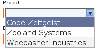

Creates form elements that allow a property of an object to be set from a drop-down list.

Besides the fact that the list being populated is dynamically retrieved via ajax it is almost identical to the PropertySelection component.
Uses a IAutocompleteModel to map between Java values that will be assigned, and textual labels that will appear in the HTML response.
A useful property selection model is available ( DefaultAutocompleteModel ). You can also create your own model, as illustrated in the examples below.
This component needs a Body component and a Shell or ScriptIncludes component to work.
See also: org.apache.tapestry.dojo.form.Autocompleter , Select , Option , Form
| Name | Type | Required | Default | Description |
|---|---|---|---|---|
| value | Object | yes | The property to set. During rendering, this property is read, and sets the default value of the selection (if it is null, no element is selected). When the form is submitted, this property is updated based on the new selection. | |
| model | IAutocompleteModel | yes | The model provides a list of possible labels, and matches those labels against possible values that can be assigned back to the property. | |
| disabled | boolean | no | false |
Controls whether the <select> is active or not. A disabled
Autocompleter does not update its value parameter. Corresponds to
the "disabled" HTML attribute.
|
| displayName | String | no | The user-presentable name for the component, which will be used by a FieldLabel connected to the component. | |
| validators | Array or collection of Validator | no |
The validators to apply to the component. Something along the lines of:
validators:required .See also: Validation |
|
| local | boolean | no | false | The autocompleter can work either in remote or in local mode. This parameter controls whether the component will contact the server for finding the matching data, or use the values that it already contains within its html nodes. In the later case, the model parameter is used during render in order to provide all possible values. Those are are then rendered as options inside the select tag of the autocompleter. |
| searchDelay | long(ms) | no | 100 ms | The amount of time to wait before initiating a server side search based on user input action. |
| fadeTime | long(ms) | no | 200 ms | The duration of the animation used to fade away the selection list. |
| maxListLength | int | no | 8 | Maximum number of items to display in drop down list. |
| forceValidOption | boolean | no | true | Set to false to allow users to enter values that may differ from the available options. |
| autoCompleteField | boolean | no | true | If the field should be automatically filled with the closest match. |
Body: removed
Informal parameters: allowed
Reserved parameters: name, autocomplete